6 July 2026 · 11 min read
How I Color Grade a Film in DaVinci Resolve (My Complete Workflow)
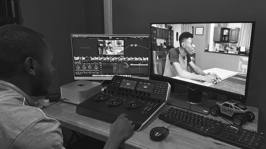
Colour grading is the stage where a film finds its emotional voice. It is also the stage most people misunderstand. They think it means dragging a slider until an image looks “cinematic,” or dropping a LUT on top and calling it done. After more than seven years grading feature films, TV drama and commercials across East Africa, projects like Mukisa, Pieces of Me and Prestige, I can tell you the real work is quieter and far more deliberate than that.
This is the exact workflow I use inside DaVinci Resolve Studio, from the moment footage lands on my drive to the final master I hand a client. There is no secret LUT in here. Just a repeatable process built on consistency, honest skin tones and serving the story.
Before you grade: setup and colour management
I never touch the grade first. When a project arrives, I organise everything. I check the camera formats, frame rates and colour spaces, and I confirm the delivery requirements with the client before I start. If the project was shot on multiple cameras, I separate each camera into its own group so I can build a consistent base correction for every camera before I ever work on an individual shot.
Next I set the project colour management. Depending on the job, I either work in DaVinci YRGB Color Managed or in DaVinci YRGB with Color Space Transform nodes. I prefer a wide-gamut workflow because it gives me far more flexibility when I am matching cameras and building the final look. Then I organise the timeline, label every clip by camera, scene and take, sync audio if needed, and, this part matters, I watch the entire project from start to finish before grading. I want to understand the story, the mood, the lighting changes and the continuity before I make a single decision.
The 13-node structure I build on every shot
Structure is what keeps a grade consistent across hundreds of shots. My node tree is almost always organised in the same order, so I always know where every correction lives:
- Noise reduction, when the shot requires it.
- Input Color Space Transform or technical normalisation.
- Exposure and white balance correction.
- Contrast and tonal balance.
- Primary colour balance.
- Shot matching.
- Creative look.
- Skin-tone refinement.
- Secondary corrections for specific colours.
- Power Windows and tracking.
- Beauty work or cleanup when required.
- Grain, halation, glow or other finishing effects.
- Output Color Space Transform or output transform.
Not every shot needs all thirteen nodes, but the order never changes. That discipline, a clean technical foundation before anything creative, is the single biggest reason a grade holds together across a whole film.
Step one: technical correction before anything creative
The first real stage is technical correction. I normalise every shot, exposure, white balance, contrast and saturation, and I make those calls using the waveform, parade, vectorscope and histogram, not just what the monitor shows me. A monitor can flatter you; the scopes tell the truth. Once my first shot is balanced, I match every other angle in the scene to it before I move into anything creative, so the whole sequence already feels consistent.
Step two: building the creative look
With the footage balanced and matched, I develop the look that carries the mood of the film or commercial. This is where I shape contrast, control colour separation and density, roll off the highlights, decide how the shadows behave and build overall colour harmony, all while protecting natural skin tones. The creative look should feel like a decision about the story, not a filter dropped over the top of it.
How I grade East African skin tones
This is the part a lot of tutorials get wrong. My approach is to preserve natural skin tones, not force a trend. East African skin tones vary enormously, so I grade each subject individually instead of pushing everyone toward the same orange-and-teal aesthetic.
I mainly read the vectorscope, waveform and RGB parade. I check that skin generally follows the skin-tone line while holding realistic luminance and never clipping the highlights. To isolate skin I build a clean HSL qualifier, refine the matte, then make subtle hue, saturation or luminance adjustments only where they are needed. In mixed lighting I use tracked Power Windows and secondary corrections to remove an unwanted colour cast without affecting the rest of the frame.
My goal is simple: natural, consistent skin tones that support the story, not the grade.
Matching cameras and formats: BRAW, S-Log3, C-Log and RED
Most of the work I receive is shot on Blackmagic cameras in BRAW, Sony FX-series in S-Log3, Canon in C-Log, and occasionally RED. I also handle mirrorless cameras, drones and phone footage when a project calls for it.
For RAW formats like BRAW and RED I prefer DaVinci Color Management because it gives me a clean, flexible starting point. For log footage such as S-Log3 and C-Log I use Color Space Transform nodes, which give me more control than a LUT ever will. I only reach for LUTs as a creative starting point, never as the foundation of the grade. My node structure stays the same across formats; the only real change is with heavily compressed or 8-bit footage, where I prioritise noise reduction and make gentler moves to avoid introducing artefacts or breaking the image apart.
Power Windows, beauty work and finishing
After the look is set, I use Power Windows and tracking to guide the viewer’s eye, brightening a face, quietly darkening a distracting background, adding a subtle vignette or isolating a practical light. Every window is carefully tracked so the correction stays invisible. If a project needs beauty work, I do it after the creative grade: soften only where necessary, reduce blemishes, and keep natural detail, because texture matters and over-processing shows.
Finishing is where I add film grain when it suits the project, refine sharpening, check for noise, verify legal broadcast levels when required, and review everything on calibrated monitoring. I watch the whole timeline several times, because a grade that looks great on one shot does not always survive across a full sequence.
Delivery: Rec.709, HDR, broadcast, YouTube and cinema
Most of my deliveries are Rec.709 for television, web and commercial work, and I tailor every export to the client’s spec rather than reusing one preset for everything. For broadcasters such as Pearl Magic Prime and GOtv, I verify legal levels, check for clipping and deliver high-quality master files, usually in ProRes or DNxHR. For YouTube and social I deliver high-bitrate H.264 or H.265 optimised for streaming. Cinema depends on the pipeline, if a DCP is required, I prepare a high-quality master for DCP creation rather than grading for compressed web delivery.
Before every export I run a final QC pass for colour consistency, legal levels and render integrity. One lesson I have learned the hard way: never assume every platform displays colour the same way. I always verify the final output before it goes out.
Grading in East Africa: a great image from imperfect footage
Working here has taught me to adapt. I regularly receive footage shot under mixed lighting, changing daylight, limited equipment or tight schedules, and the job is always to get the best possible result from what is available. A challenge I solve often is recovering underexposed or inconsistent footage, with careful exposure balancing, shot matching, selective secondaries and noise management I have rescued scenes that first looked unusable while keeping them natural.
My advice to directors is simple: expose properly, keep white balance consistent, avoid mixing colour temperatures where you can, and shoot the highest-quality codec available to you. A well-exposed image always grades better than one that needs heavy correction. The better the footage on set, the more time in post goes into enhancing the story instead of fixing technical problems.
My setup and tools
I grade in DaVinci Resolve Studio with a DaVinci Resolve Mini Panel, which gives me faster, more precise control over primary and secondary corrections than a mouse ever could. My setup runs on a high-performance workstation with a calibrated reference display for critical colour decisions and a second monitor for the timeline and scopes, and I recalibrate the display regularly to keep it honest.
I keep the toolkit deliberately simple and mostly native: Color Space Transform, Noise Reduction, Film Grain, Power Windows, Qualifiers and Magic Mask when it helps. Rather than depending on LUT packs, I use my own PowerGrades, built up over years of grading different projects. Most of my inspiration comes from the story itself, alongside references from feature films, high-end commercials and cinematographers whose visual language fits the project.
How I work with directors and clients
Every project starts with a conversation. I discuss the creative vision with the director or cinematographer, review visual references and agree on the overall look before grading begins, that alone prevents most unnecessary revisions later. As a rough guide, a music video takes one to two days, a commercial one to three days, and a feature depends on its length and complexity.
I usually provide up to two review rounds, shared either in person or remotely with preview exports and stills for approval. Once the look is signed off, I apply the feedback, run a final quality check and deliver the masters in the required formats. The smoothest projects always share the same three things: well-prepared footage, clear creative references, and early communication.
Case study: grading Mukisa
One project I am especially proud of is Mukisa. The director wanted an intimate, emotional, cinematic look that still felt natural and kept the audience focused on the characters. My goal was rich contrast, a soft highlight roll-off, warm skin tones and slightly muted backgrounds to reinforce the emotional weight of the story.
Once the footage was balanced and matched, I built the look with contrast shaping, colour separation, selective saturation and subtle Power Windows to guide attention, and I refined skin tones throughout the film to keep them consistent across very different lighting. The hardest part was matching scenes shot under rapidly changing daylight, as clouds moved, exposure and colour temperature shifted between takes, and the continuity fell apart. I rebalanced it using the scopes, shot-matching tools, secondary corrections and tracked Power Windows to even out different areas of the frame without touching the whole image. The final grade gave the film a cohesive, cinematic feel while keeping skin natural, a grade that served the narrative instead of drawing attention to itself.
The biggest colour grading mistakes (and what to do instead)
These are the ones I see most often:
- Using a LUT as the final grade. Build a solid technical correction first; a LUT is a starting point, not a foundation.
- Grading by eye on an uncalibrated monitor. Let the scopes guide exposure, balance and consistency.
- Over-saturating and crushing contrast. Pushed too far, both destroy natural skin tones.
- Grading each shot in isolation. Match the whole scene, or the continuity breaks.
- Heavy noise reduction and sharpening. Too much removes texture and creates an artificial, plastic look.
The best grades are usually the ones you do not notice. Focus on consistency, natural skin tones and serving the story instead of chasing a trend.
If you are learning to grade, start here
My biggest piece of advice for anyone learning DaVinci Resolve is to master colour correction before colour grading. Learn exposure, white balance, shot matching and how to read the scopes before you go chasing cinematic LUTs or trendy looks. A strong technical foundation will always beat any preset.
And the myth I most want to bust: great colour grading does not come from expensive LUTs. It comes from understanding light, colour and consistency. The tools only help you get there.
Work with me
If you have a feature, TV drama, commercial or music video that needs colour grading, or a full cinematography and post-production pipeline, I would love to help. You can see more of my work on the projects page, read more about how I work, or get in touch directly at jpmboira@gmail.com or on WhatsApp at +256 703 821 839.
Frequently asked questions
- What is the first thing you do when you start a grade in DaVinci Resolve?
- Before touching a single wheel I organise everything: I check camera formats, frame rates and colour spaces, confirm the delivery specs with the client, and group footage by camera so I can build a consistent base correction per camera. Then I set project colour management, sync and label the timeline, and watch the whole film start to finish to understand the story before I grade a frame.
- Should I use DaVinci Color Management or LUTs?
- For RAW formats like BRAW and RED I prefer DaVinci Color Management because it gives a clean, flexible starting point. For log footage such as S-Log3 and C-Log I use Color Space Transform nodes, which give more control than LUTs. I only use LUTs as a creative starting point, never as the foundation of a grade.
- How do you keep skin tones natural when colour grading?
- I grade each subject individually instead of pushing everyone toward the same orange-and-teal look. I read the vectorscope, waveform and RGB parade, keep skin roughly on the skin-tone line with realistic luminance and no clipping, then isolate it with a clean HSL qualifier and make subtle hue, saturation or luminance adjustments only where needed. In mixed lighting I use tracked Power Windows and secondaries to remove colour casts without touching the rest of the frame.
- How long does colour grading take?
- A music video is typically one to two days, a commercial one to three days, and a feature film depends on its length and complexity. I usually include up to two review rounds, shared in person or remotely with preview exports and stills for approval.
- What is the most common colour grading mistake beginners make?
- Relying on LUTs as a finished grade instead of building a solid technical correction first, and grading by eye on an uncalibrated monitor while ignoring the scopes. Scopes should guide exposure, balance and consistency. The monitor alone will lie to you.
- Do you need expensive LUTs to get a cinematic look?
- No. Great grades do not come from expensive LUT packs. They come from understanding light, colour and consistency. The tools only help you get there. I build and reuse my own PowerGrades rather than depending on LUT packs.